Company
Brand guidelines
Logos and guidance for showing Paid clearly and consistently.
Naming
In writing, we’re “Paid”: one word with a capital “P”, for both the company and the product. Please don’t write “Paid AI” or “Paid.ai”; paid.ai is our web address.
The logo is different: its wordmark is always lowercase, “paid”, so the “p” and the “d” mirror each other. Never recreate it in capitals or type it out in another font. Use the files below.
Clear space
Give the logo room to breathe. Keep a margin around it at least the height of the “a” in the wordmark on every side: upright above and below, on its side left and right. The margin scales with the logo, and nothing else, text or edge, should cross it.
Usage
Use the two-colour logo where you can, otherwise black on light backgrounds and white on dark ones. Don’t stretch, rotate, recolour, outline or add effects to it, and don’t use it in a way that suggests Paid endorses your product.
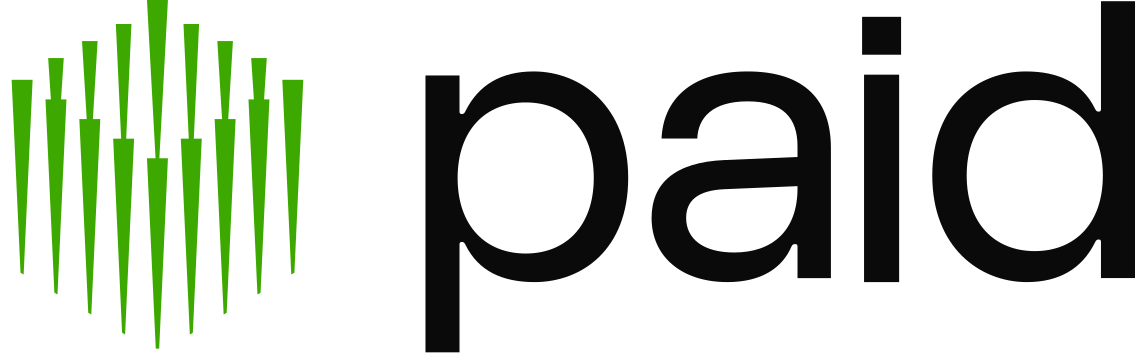
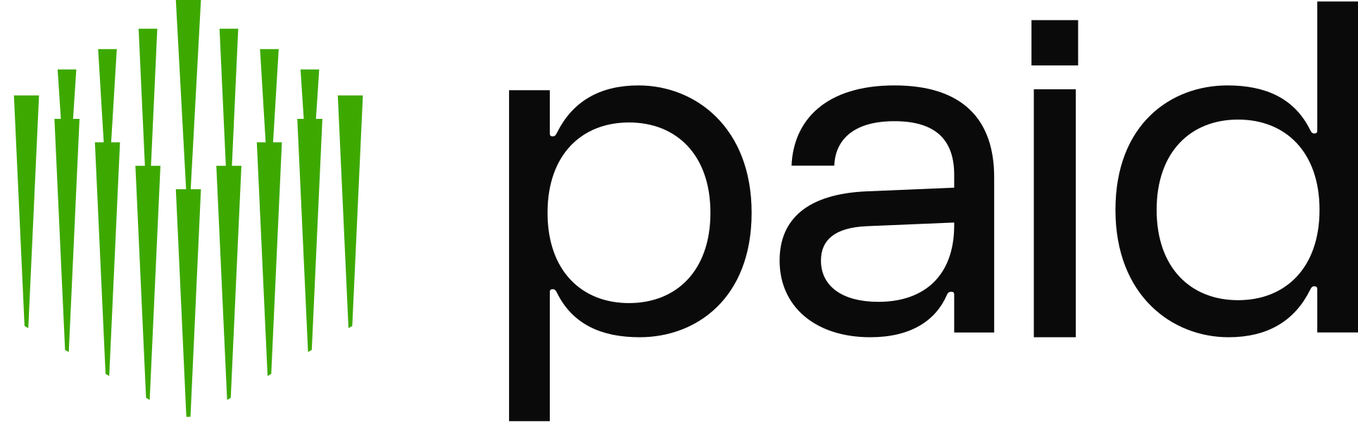
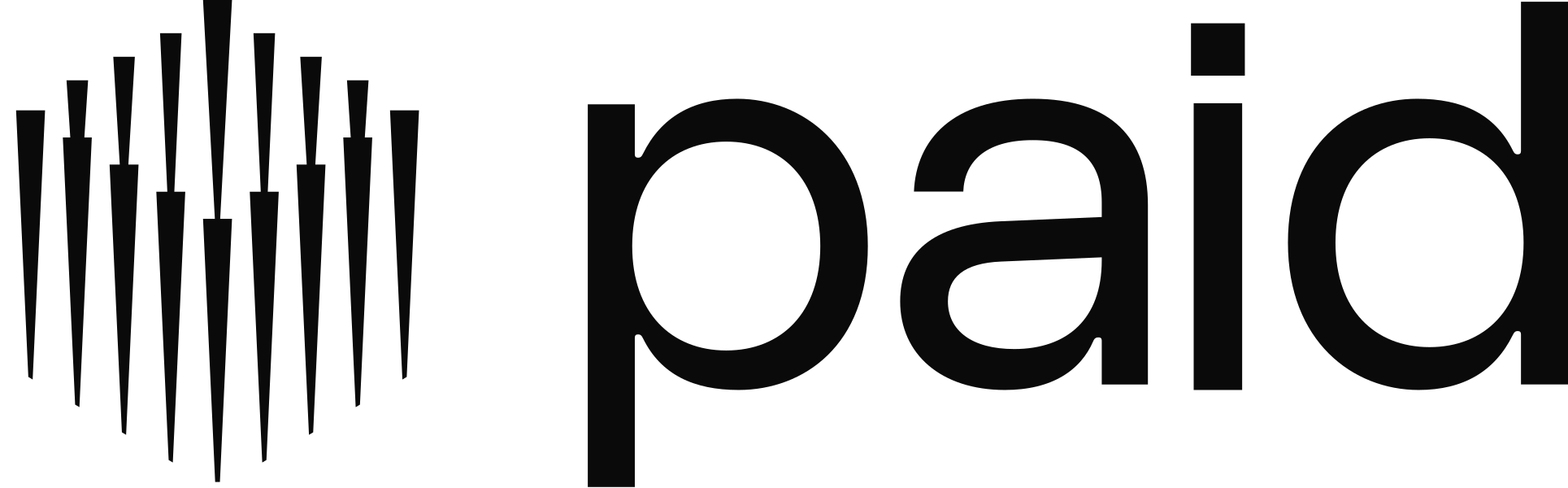
Paid logo
The mark and the wordmark together, and the most recognisable way to show Paid. Use the two-colour version, with the mark in Paid green, wherever you can, and black or white when only one colour is possible.


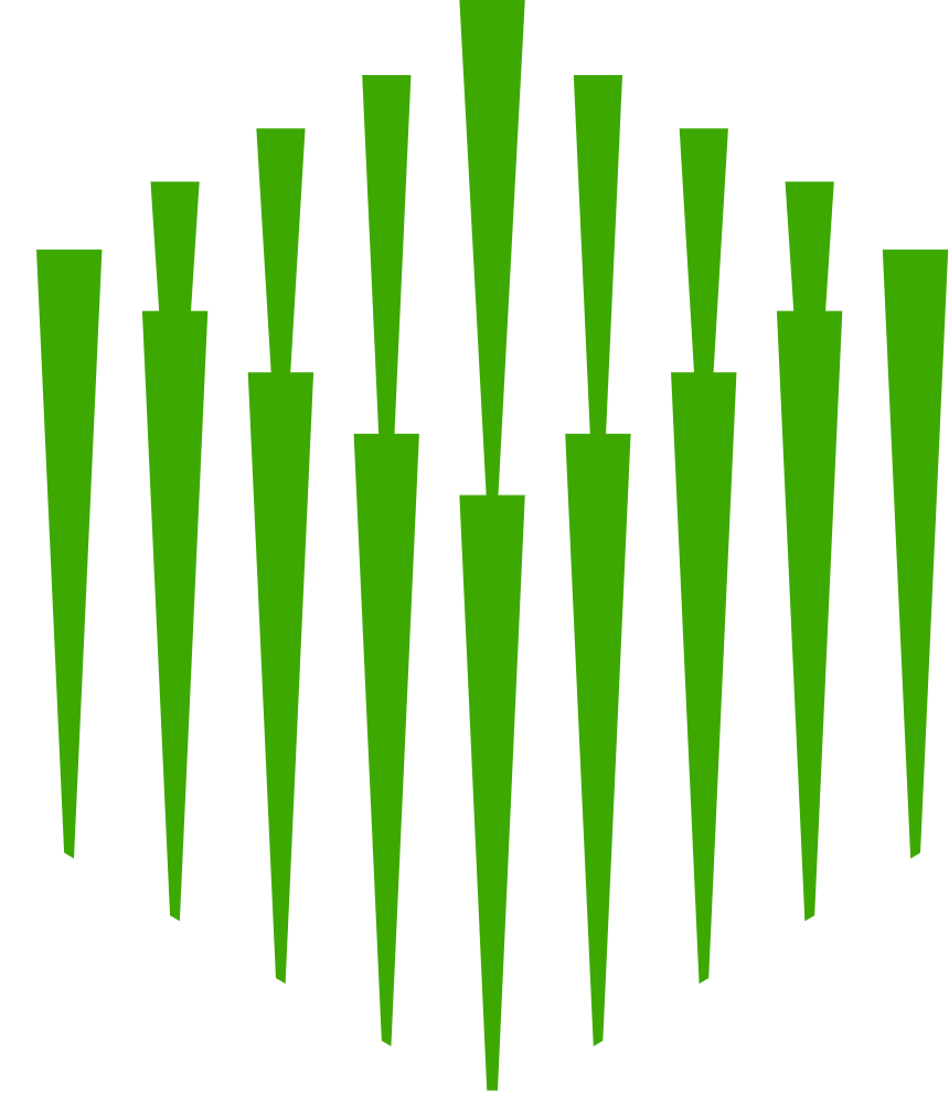
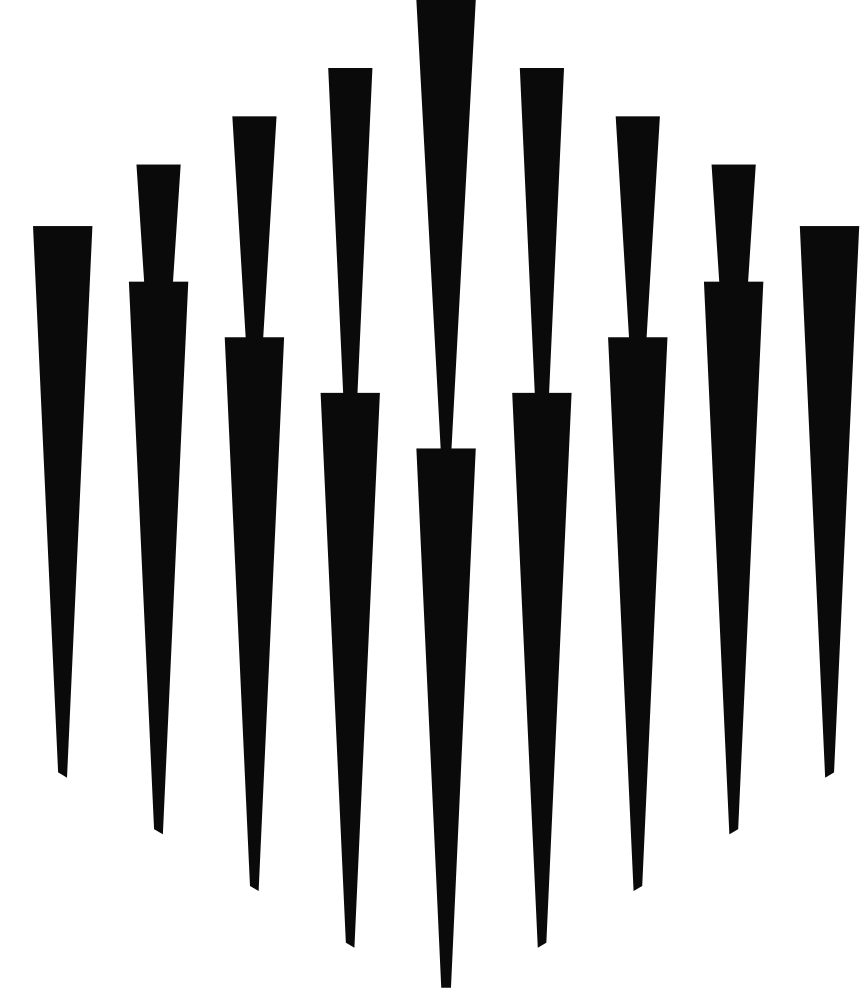
Paid mark
The symbol on its own, for tight layouts, logo grids, avatars and app icons. Prefer the full logo when space allows. In green it works on dark and light backgrounds alike; on a Paid green background, use it in black.




Colours
Black and white are our foundations, with Paid green as a bold accent. Use Ink and Neutral for the logo in one colour, and keep green for the mark and for moments that should stand out.